目次
+ matplotlib.pyplot.subplots
+ サンプル
+ 投影法を指定する
+ レイアウトを調整する
+ 色を変更する
+ 共通の軸ラベルを設定する
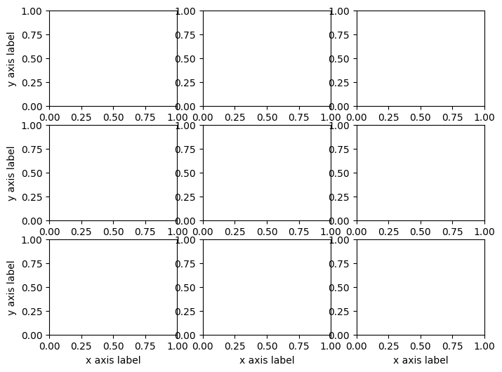
+ 図全体に付ける
+ 左と下の図に付ける
+ 共通のカラーバーを描く
matplotlib.pyplot.subplots
公式ドキュメント:
matplotlib.pyplot.subplots — Matplotlib 3.8.4 documentation
matplotlib.pyplot.subplots(nrows=1, ncols=1, *, sharex=False, sharey=False, squeeze=True, width_ratios=None, height_ratios=None, subplot_kw=None, gridspec_kw=None, **fig_kw)
引数
nrows, ncols: int.デフォルト値: 1
それぞれ行数,列数を指定する.
sharex, sharey: bool or {'none', 'all', 'row', 'col'}.デフォルト値: False
各図の間でのx軸,y軸の共有を制御する.
squeeze: bool.デフォルト値: True
戻り値のaxの型を制御する.行数または列数が1の時,配列の対応する軸を消す.
Trueのとき:
1行1列のとき,axは単体のAxesとなる.
1行N列(N>1)またはM行1列(M>1)のとき,axはそれぞれAxesの長さNまたは長さMの配列となる.
Falseのとき:
N行M列のとき,axは形状[N,M]のAxesの配列となる.N=1またはM=1のときも同様に動作する.
width_ratios: 長さncolsの配列様オブジェクト.オプショナル
列の幅の比率を指定する.各列の相対幅はwidth_ratios[i] / sum(width_ratios).
height_ratios: 長さnrowsの配列様オブジェクト.オプショナル
行の高さの比率を指定する.width_ratiosと同様.
subplot_kw: dict. オプショナル
add_subplot APIにおいてキーワードで与えられるオプションを指定する.
subplot_gridspec: dict. オプショナル
GridSpec APIにおいてキーワードで与えられるオプションを指定する.
**fig_kw
pyplot.figure APIで指定可能な引数をキーワードで指定する.
戻り値
fig: Figure
ax: AxesまたはAxesの配列
サンプル
以下では次のようにimportしているものとする.
まずはグラフ用に適当なデータを作る.
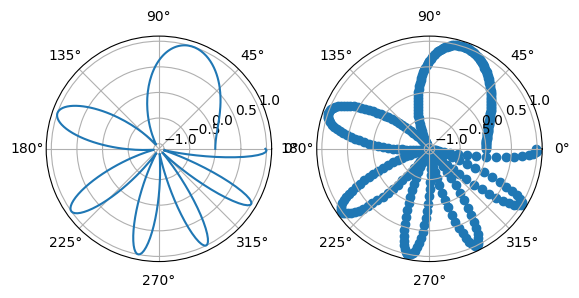
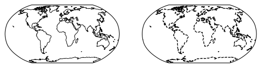
投影法を指定する
subplot_kwにdict型でprojectionを与える.
projectionにはstr,またはcartopy.crsのProjectionなどを与える.
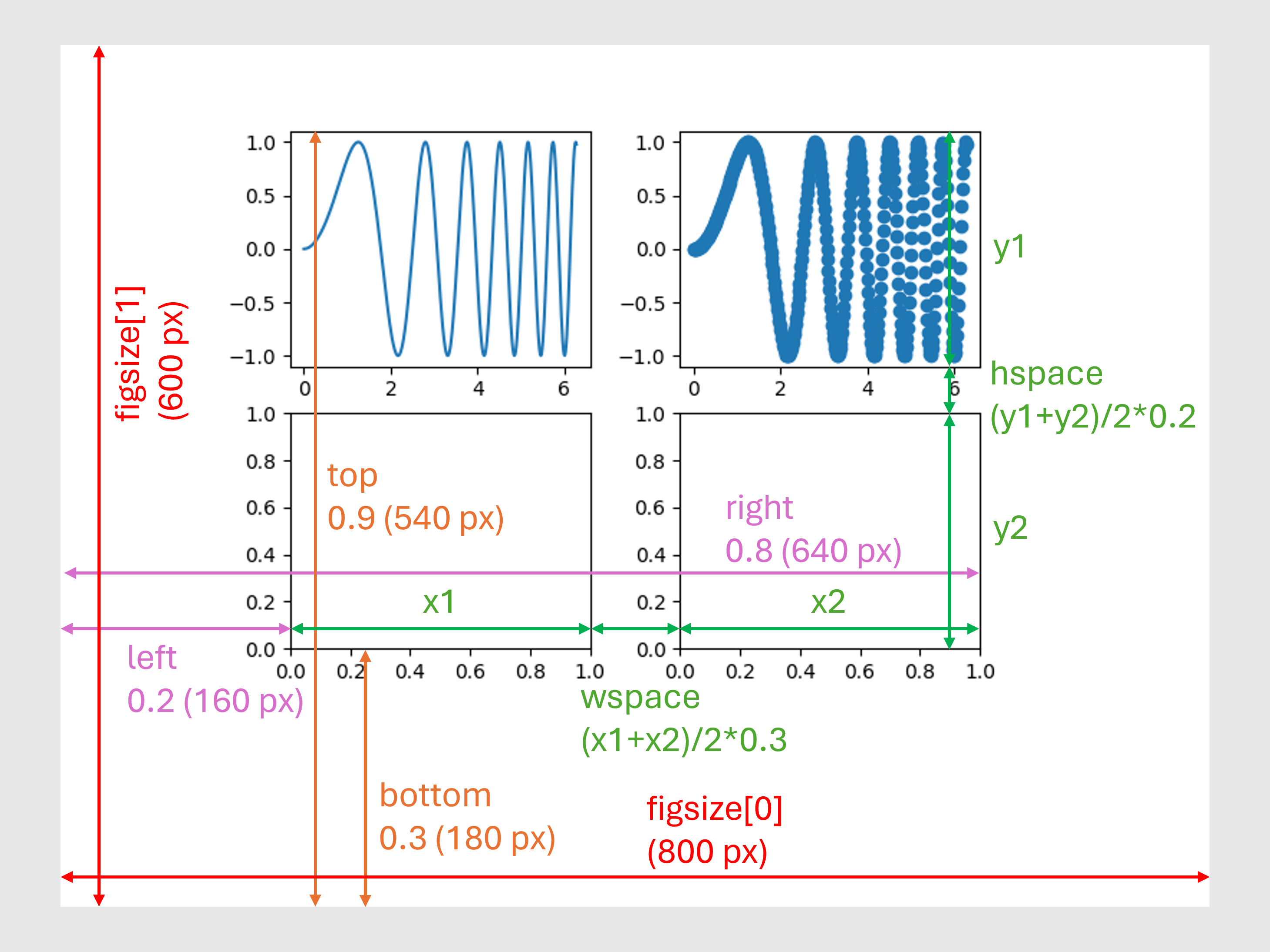
 レイアウトを調整する
left, right, bottom, topでsubplotsの描画領域に対する相対位置を,wspace, hspaceで各subplotの間の広さを指定する.
wspaceは軸の幅の平均値に対するsubplot間の横方向の間隔の比率.hspaceも同様,ただし縦方向に関して指定する.
これをdpi=100で保存した場合,レイアウトは図のようになる.
レイアウトを調整する
left, right, bottom, topでsubplotsの描画領域に対する相対位置を,wspace, hspaceで各subplotの間の広さを指定する.
wspaceは軸の幅の平均値に対するsubplot間の横方向の間隔の比率.hspaceも同様,ただし縦方向に関して指定する.
これをdpi=100で保存した場合,レイアウトは図のようになる.
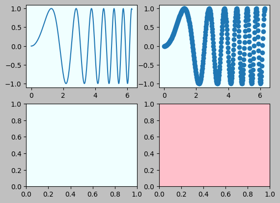
 色を変更する
描画領域の色はplt.figureと同じようにfacecolorなどで指定する(ここではdictにして与えているが,直接与えても良い).
各subplotの色はsubplot_kwで与える.
subplot別に与える場合は普通にset_facecolorを使えば良い.
色を変更する
描画領域の色はplt.figureと同じようにfacecolorなどで指定する(ここではdictにして与えているが,直接与えても良い).
各subplotの色はsubplot_kwで与える.
subplot別に与える場合は普通にset_facecolorを使えば良い.
レイアウトを調整する
left, right, bottom, topでsubplotsの描画領域に対する相対位置を,wspace, hspaceで各subplotの間の広さを指定する.
wspaceは軸の幅の平均値に対するsubplot間の横方向の間隔の比率.hspaceも同様,ただし縦方向に関して指定する.
これをdpi=100で保存した場合,レイアウトは図のようになる.
色を変更する
描画領域の色はplt.figureと同じようにfacecolorなどで指定する(ここではdictにして与えているが,直接与えても良い).
各subplotの色はsubplot_kwで与える.
subplot別に与える場合は普通にset_facecolorを使えば良い.
共通の軸ラベルを設定する
図全体に付ける
fig.supxlabel, fig.supylabelを使う.
文字の属性(大きさなど)や位置等の指定もできる.詳しくは公式ドキュメントを参照.
matplotlib.figure.supxlabel:
matplotlib.figure — Matplotlib 3.8.4 documentation
matplotlib.figure.supylabel:
matplotlib.figure — Matplotlib 3.8.4 documentation
(なんかidタグが上手く機能しなくて目的の項目に飛ばないことがあるので,そういうときはsupxlabelで検索するなどしてください.辞書並びなので普通に上から探しても良いです)
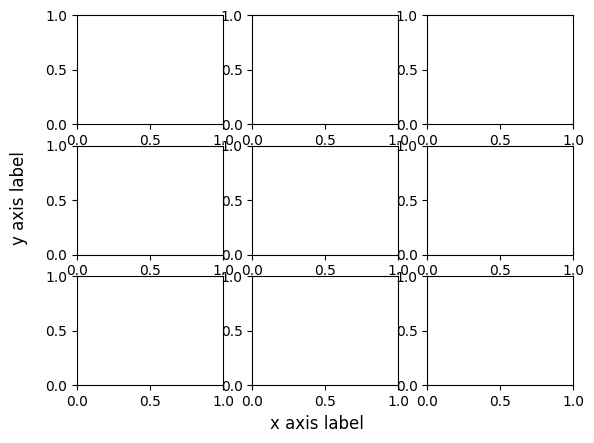 左と下の図に付ける
方法1. plt.setpを使う
setpはラベル設定用の手続きではなくもっと汎用的な,描画オブジェクト(Artistと呼ばれるもの)の属性情報を更新するもの.
詳細は公式ドキュメントに譲るとして,ここではとにかくplt.subplotsで得られたaxをplt.setpに与えてそれらの軸ラベルを更新する方法だけ述べる.
setp:
matplotlib.pyplot.setp
Artist:
matplotlib.artist — Matplotlib 3.8.4 documentation
左と下の図に付ける
方法1. plt.setpを使う
setpはラベル設定用の手続きではなくもっと汎用的な,描画オブジェクト(Artistと呼ばれるもの)の属性情報を更新するもの.
詳細は公式ドキュメントに譲るとして,ここではとにかくplt.subplotsで得られたaxをplt.setpに与えてそれらの軸ラベルを更新する方法だけ述べる.
setp:
matplotlib.pyplot.setp
Artist:
matplotlib.artist — Matplotlib 3.8.4 documentation
 方法2. 個別に設定する
plt.setpではArtist(ここではax)が受け取れる属性情報しか指定できないので,軸ラベルの文字列は与えることができてもそのフォントサイズなどの指定は結局各subplotごとに行うしかないらしい.
set_xlabel:
matplotlib.axes.Axes.set_xlabel — Matplotlib 3.8.4 documentation
方法2. 個別に設定する
plt.setpではArtist(ここではax)が受け取れる属性情報しか指定できないので,軸ラベルの文字列は与えることができてもそのフォントサイズなどの指定は結局各subplotごとに行うしかないらしい.
set_xlabel:
matplotlib.axes.Axes.set_xlabel — Matplotlib 3.8.4 documentation
 参考:
python - How to set common axes labels for subplots - Stack Overflow
参考:
python - How to set common axes labels for subplots - Stack Overflow
左と下の図に付ける
方法1. plt.setpを使う
setpはラベル設定用の手続きではなくもっと汎用的な,描画オブジェクト(Artistと呼ばれるもの)の属性情報を更新するもの.
詳細は公式ドキュメントに譲るとして,ここではとにかくplt.subplotsで得られたaxをplt.setpに与えてそれらの軸ラベルを更新する方法だけ述べる.
setp:
matplotlib.pyplot.setp
Artist:
matplotlib.artist — Matplotlib 3.8.4 documentation
方法2. 個別に設定する
plt.setpではArtist(ここではax)が受け取れる属性情報しか指定できないので,軸ラベルの文字列は与えることができてもそのフォントサイズなどの指定は結局各subplotごとに行うしかないらしい.
set_xlabel:
matplotlib.axes.Axes.set_xlabel — Matplotlib 3.8.4 documentation
参考:
python - How to set common axes labels for subplots - Stack Overflow
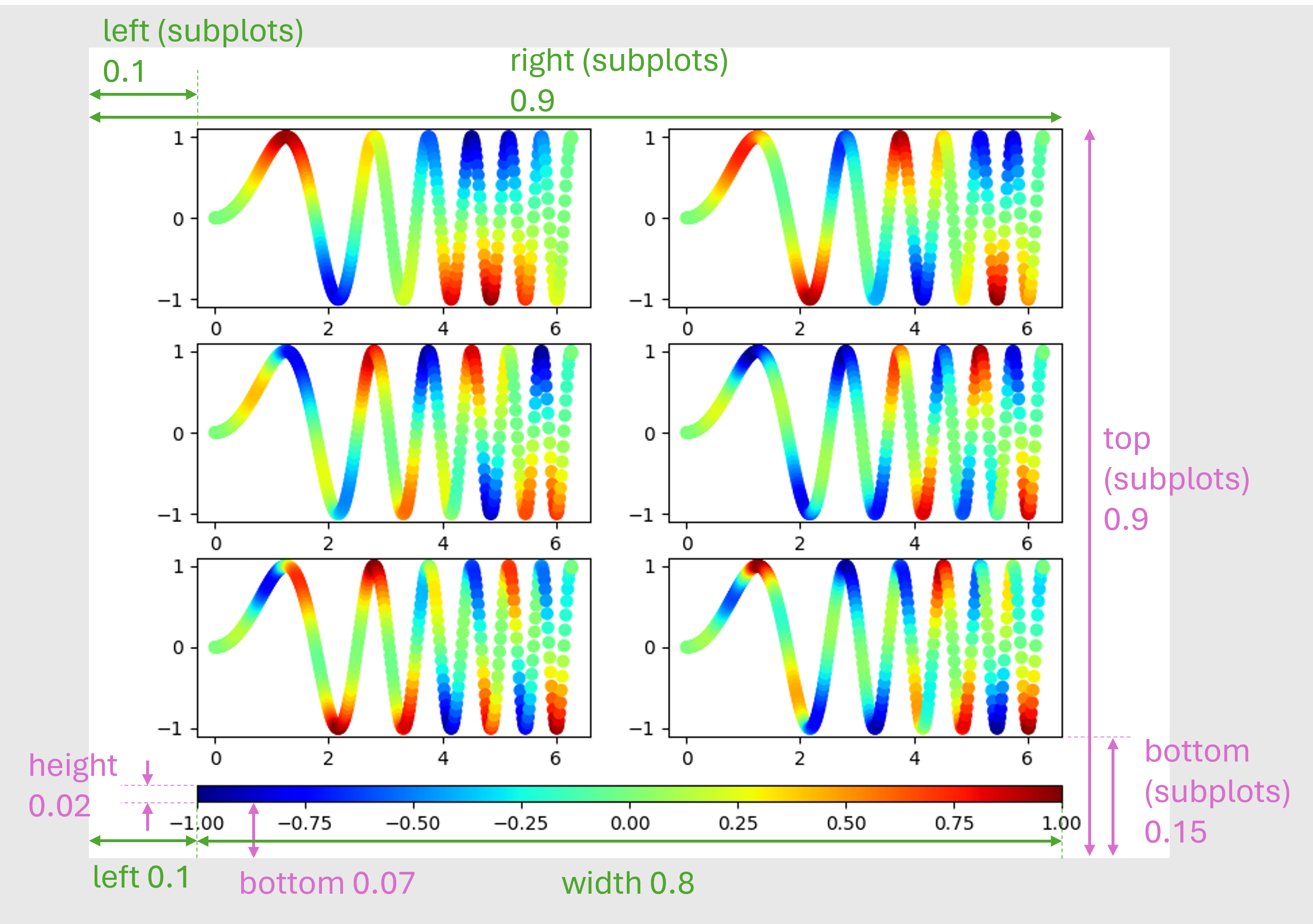
共通のカラーバーを描く
ここではpyplot.subplotsを使う.見せたいグラフはここまでと同じようにsubplotsを作成してそれぞれ描画する.
もちろんカラーバーが共通なので,カラーマップや値の範囲の指定をきちんとする必要がある.
カラーバーを描くにはそれに対応する描画オブジェクトが必要である.ここではsubplotsのいずれかになるわけだが,そうするとレイアウトの調整などがちょっとしづらくなるので,専用のオブジェクトを別に生成する.カラーバー用の軸はfigure.add_axesで生成する.
またグラフとカラーバーが重ならないようそれぞれの位置と大きさを設定する.いずれもオブジェクトを生成する際に行う.
pyplot.subplotsのgridspec_kwではleft, right, bottom, topで描画領域内での相対位置を指定する.
一方figure.add_axesではleft, bottom, width, heightのtupleを引数に与える.つまり図の左端と下端の位置,及び幅と高さを描画領域に対する相対値として指定する.
このことを念頭に,オブジェクト同士が重ならないよう適切な値を設定する.この具体的な値は当然,カラーバーの向きや軸ラベルに取られるスペースなどによって変わるので,描画しつつ調整することになる.同じレイアウトの図を何度も作るなら良いが,そうでないなら結局のところパワポなどを使ってカラーバーだけ手動で付けるのが楽だと思う.
ScalarMappable:
matplotlib.cm — Matplotlib 3.8.4 documentation
figure.add_axes:
matplotlib.figure — Matplotlib 3.8.4 documentation
 参考:
matplotlibの複数subplotで共通のカラーバーを表示する #matplotlib - Qiita
参考:
matplotlibの複数subplotで共通のカラーバーを表示する #matplotlib - Qiita
参考:
matplotlibの複数subplotで共通のカラーバーを表示する #matplotlib - Qiita